At Smart Kitchen , we’re committed to making kitchen renovations easy, affordable, and accessible. We also love it when our customers want to play an active role in the renovation process. In fact, we design our products to be so simple to install that almost anyone can do it.
That’s why we’re so proud of the recently completed Heidelberg Heights Kitchen Renovation. Not only does the final result look great, the space functions well and suits the homeowners. They were also deeply involved in the design, preparation, and installation phases.
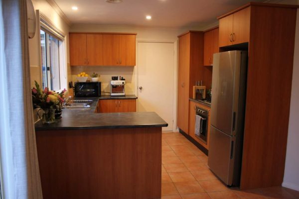
While the existing kitchen was in fairly good condition, it really didn’t suit the homeowners’ style. The wood-look cabinetry and darker laminate benchtops felt quite dated and made the space feel tighter than it was. And the terracotta floor tiles and cream tile splashback only reinforced this feeling.
Beyond that, the layout actually worked fairly well. There were separate work zones, a good amount of bench space, and the relatively small area was being used reasonably efficiently. While there were definitely opportunities to optimise the storage space, the basic structure was all there.
With that in mind, Andreas, our Moorabbin designer, recommended leaving the floorplan largely untouched. Given this was already working for the homeowners there was no need to make any significant changes. Maintaining the existing positioning of services also helped keep the renovation cost down.
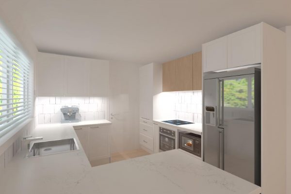
Instead, he mostly focused on creating the sleek look the homeowners were after. As part of this, he worked closely with them to select a bright and clean material palette. He also developed a detailed 3D render to help them picture how all their design choices would work together.
Once everyone was happy with how the proposed space was looking, the design was signed off and work began. The homeowners were keen to be part of the process and decided to do a number of activities, like measuring and demolition, themselves. This gave them a greater sense of ownership over the final design, while helping them save on installation costs.
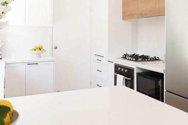
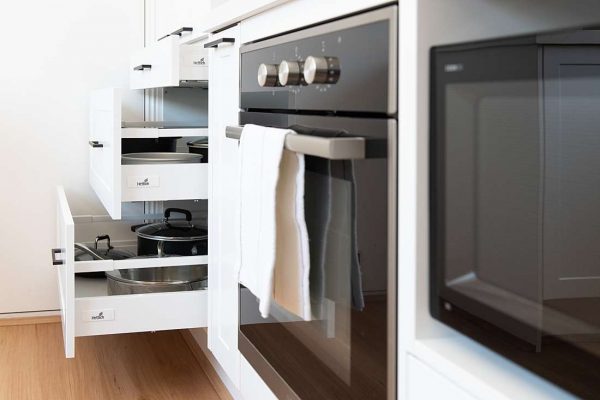
While the new kitchen largely stuck to the previous layout, a few useful upgrades were made. Most significantly, to improve the functionality of the space, drawers were added below the benchline, next to the cooking area. These are the perfect storage for pots and pans, which can now be easily lifted up and placed onto the cooktop.
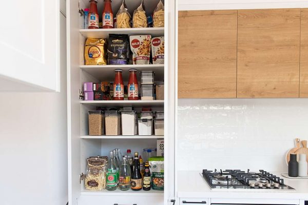
While this did eat a little into the pantry space, there is still ample space for many shelves to fit all pantry items, including sufficient space for dry storage.
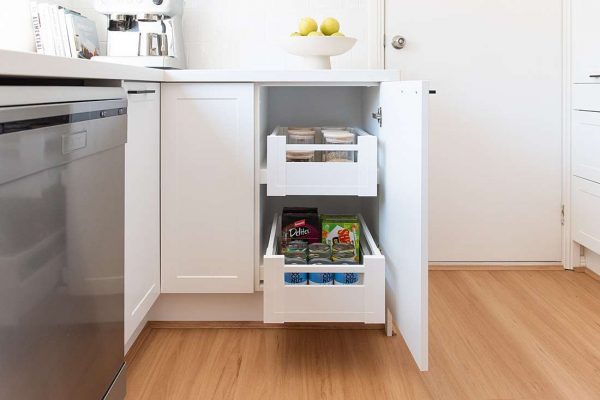
This is complemented by inner drawers in some of the under-bench cabinets, and a narrow pull out pantry next to the oven.
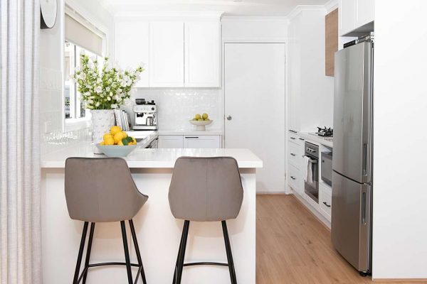
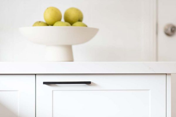
To make the space feel lighter and larger, Andreas recommended a crisp colour scheme, accented with warmth and texture. The white Shaker style cabinets are offset perfectly by the Excel overhead cabinets in Urban Oak above the cooktop.
The Caesarstone benchtops in Aterra Blanca add subtle depth and movement to the space. This is a new product that will probably look familiar to any fans of The Block, having made an appearance in the latest season.
The look is completed with slim black handles and a combination of square and subway White Newport Gloss pattern tiles. And the AAK Hybrid Timber floors in Blackbutt 7mm adds warmth, while creating flow between the kitchen and adjoining dining area.
With all works now complete, the homeowners are very happy with both the look and function of their new kitchen.
You can watch their testimonial here:
If you would like to create something similar in your home, contact Smart Kitchen today to book your complimentary consultation.
