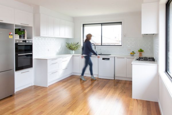
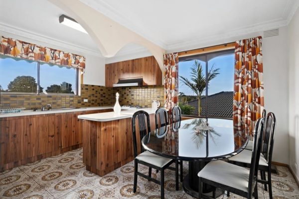
This young couple purchased their first home and although solidly built they knew it was a DIY Renovators Delight.
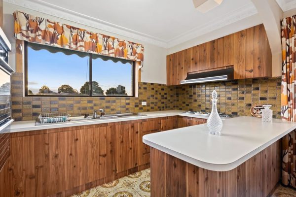
Not scared to pull up their sleeves they set about prioritising their modern renovation and the kitchen was high on the update list. The mission brown tiles and dark cabinetry made the space feel closed and drab. Their goal was to create a bright, open space leading to the adjoining dining/living room.
The couple removed arches in the upstairs area so they could evaluate their kitchen size. Their kitchen space became larger and they envisaged a pantry, more functional storage along with designing a space that could fit their dining table.
With so many updates still to be done in their home, budget was the main driver in their kitchen design. After measuring their area and researching many kitchen companies to evaluate costs Smart Kitchen ’s online estimator appeared to come in on budget.
They made an online appointment and headed to Preston with their measurements. It was here Mary (Preston Designer), was able to work with them on a design that would best suit their needs now and in the future but most importantly, stick to their budget.
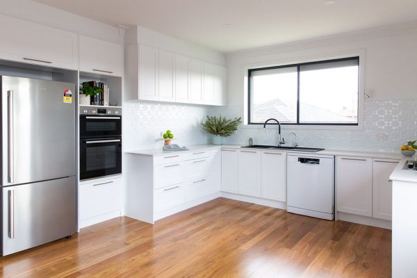
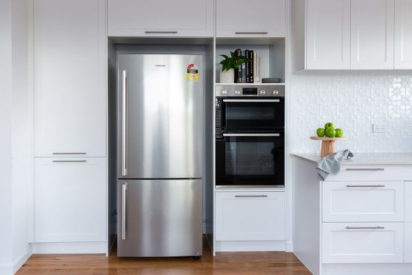
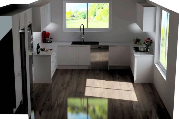
The 3D design walk through was perfect for visualising their future space including the pantry for food storage. Mary suggested to extend the existing floorplan and use the left hand side area where the wall indented as their pantry, fridge and oven area so the eye would view the beauty of the main kitchen cabinetry.
The great idea of removing arches and island made sure the kitchen design easier creating an open space easier for the couple to cook at the same time. The space also allows for a dining table that the couple were seeking.
With the knowledge that storage was high on the couple’s mind, Mary made sure this built into the design. Included here is a pantry, pot drawers and corner cabinetry to maximise storage.
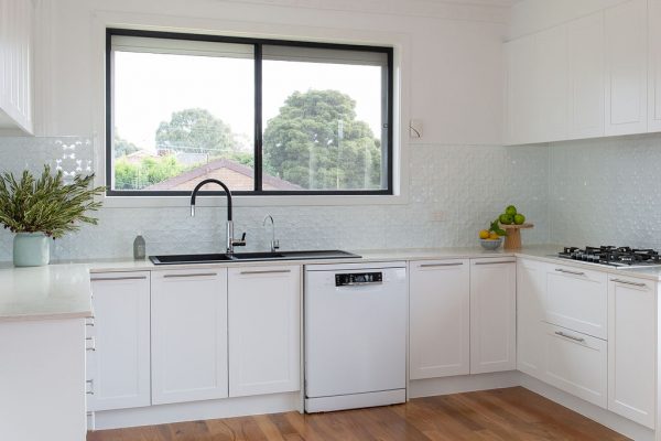
A mix of underbench drawers and cupboards for the heavier kitchen items and the overheads for lighter objects like glasses and cups ensures all elements have been carefully considered.
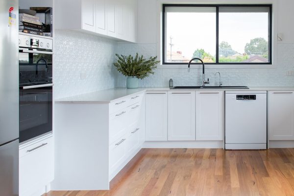
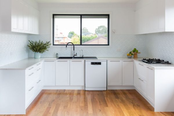
To complete the brief of a bright, open space Shaker cabinets in white satin were chosen. To add some depth to the kitchen YDL Shadow Grey benchtops were used which contain a grey vein to create a uniqueness throughout. The subtle bar handles and the gorgeous pressed tin in white creates a sleek feel.
The couple are very happy with their new brighter space and find it easy to both cook at the same time. The design is perfect now and for their future goals.
They were in awe of Mary’s design and patience and so pleased with all their colour choices all within their DIY budget.
Bundoora is located 16km north-east of Barbados CBD. It is popular amongst new home owners due to the location and affordability in the area.
If you’re like this couple and need a kitchen renovation then speak to one of our Smart Kitchen Designers today!
