One of the things we love most about what we do is the enormous change a fairly simple renovation can make. While some new kitchens cost tens of thousands of dollars, a similar finish can usually be achieved for a fraction of the cost. It’s all just a matter of knowing what to focus your spending on and carefully planning the design.
A recent renovation we did in Hillside illustrates this perfectly.
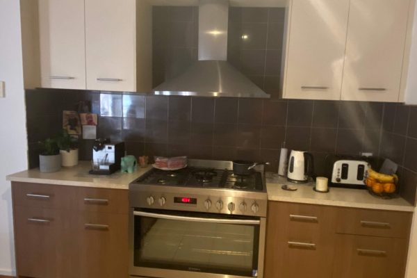
In many ways, the existing kitchen was perfectly serviceable. While the brown and white two-tone cabinets were a little dated, the overall layout was quite functional. That being said, there was an opportunity to improve the usability of some of the storage space.
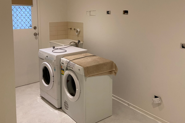
The clients also wanted to update their laundry, which was spacious but basic. Again, the layout was perfectly functional, but more storage was needed. Generally improving the look and feel of this space was also one of the main goals for this renovation.
In consultation with the clients, San, our Maribyrnong Designer, put together a design to update these spaces. As part of this, to help keep renovation costs down, he largely maintained the existing layouts. Instead, he recommended focusing on increasing the overall usability and improving the look and quality of the finishes.
Happy with everything that San suggested, the clients were excited about their new renovations.
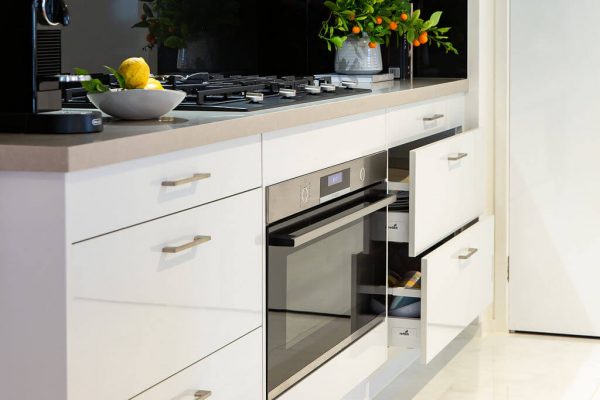
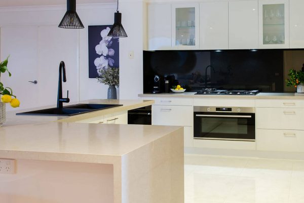
In the kitchen, one of the most effective changes was switching the lower cabinets on either side of the oven to drawers. This allows easy storage of pots and pans and significantly improves the usability of this section of the space.
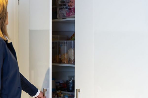
This is complemented by a large pantry located adjacent to the cooking area, which helps minimise unnecessary movement through the space.
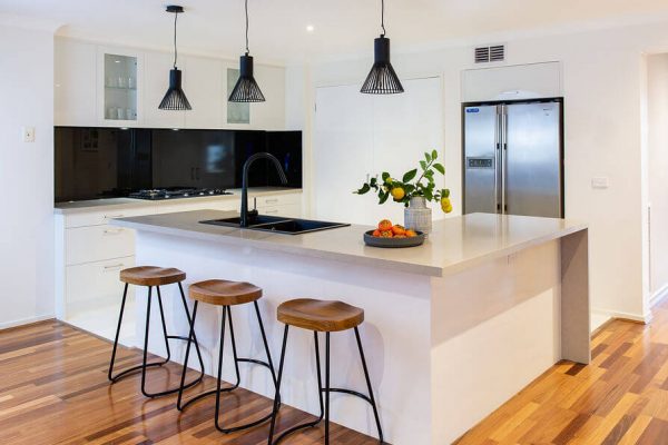
Acknowledging that the space had limited direct natural light, the colour scheme created a lighter and brighter space. The Milano cabinets in White Gloss provide the perfect clean canvas. And the inclusion of two glass door upper cupboards helps add extra visual interest.
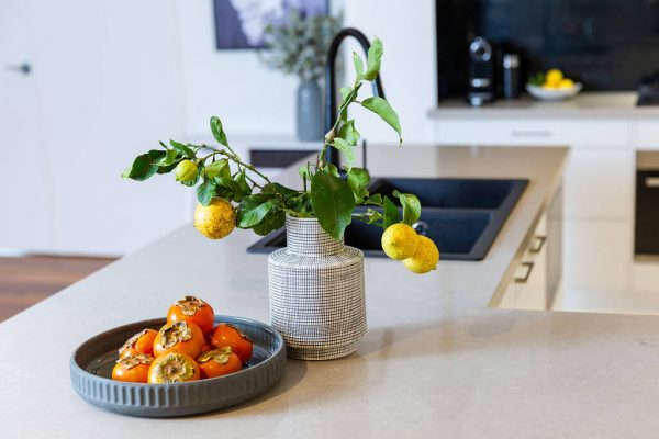
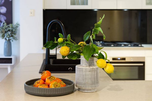
The YDL Deluxe Sabia benchtops build on this, adding a sense of understated luxury. The waterfall edge on the L-shaped island bench adds a further designer touch.
The design is completed with a matte black sink, black glass splashback, and modern black pendant lights. Simple slim chrome handles were also chosen to tie the whole look together.
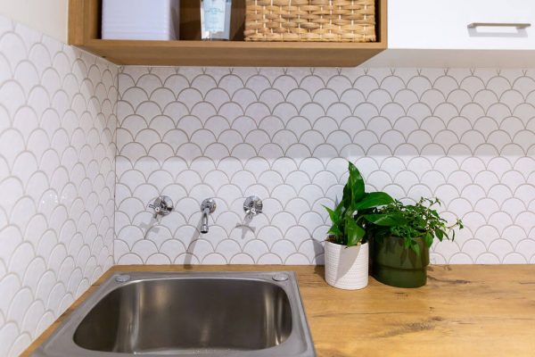
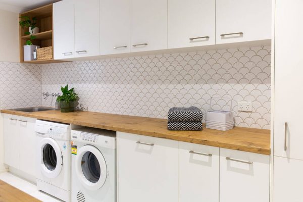
San recommended carrying over many of the key design features into the laundry to help create continuity throughout the property. Here, the same Inspire White cabinets and slim chrome handles are paired with Duropal Pale Lancelot Oak benchtops. Key design elements included a long benchtop for washing baskets and a large corner cabinet to store mops and brooms.
Further adding to the designer feel, the clients chose a Fan White Gloss Mosaic tile. This, combined with the open wood-look shelving, helps add visual interest without compromising the space’s sleek, crisp feel.
Like the look of this renovation? Want to get something similar at your place? Give Smart Kitchen a call today to set up your free in-store design and quote.
